A print ad cannot be edited after it runs, so a cluttered layout or a missing brand cue can cost a placement its impact. The examples below show what works instead: one idea per ad, a visual and headline that depend on each other, an unmistakable brand sign-off and a design built for where the ad will be seen.
Good print ads make one point that a reader gets in seconds, and they do it with a visual and a headline that need each other. Below, documented examples are sorted by use case: food brands (Heinz in 2017, KFC in the UK in 2018) and children and families (the Smokey Bear campaign, running since 1944), each broken down with the same five parts. For student research, Duke University’s Ad*Access archive of more than 7,000 ads from 1911 to 1955 comes with step-by-step instructions for doing the same breakdown yourself.
Key points:
- Judge every example with the same five parts: visual, headline, body copy, brand sign-off and placement.
- The strongest examples here leave something out and let the reader complete it.
- Facts about each campaign come from the sources listed; the breakdowns are this site’s reading, not award citations.
- Study the structure; do not copy artwork or copy into your own ad.
This page links to and describes ads rather than reproducing them, and it says nothing about results, because none of the sources publish verified sales effects.
What makes a print ad work?
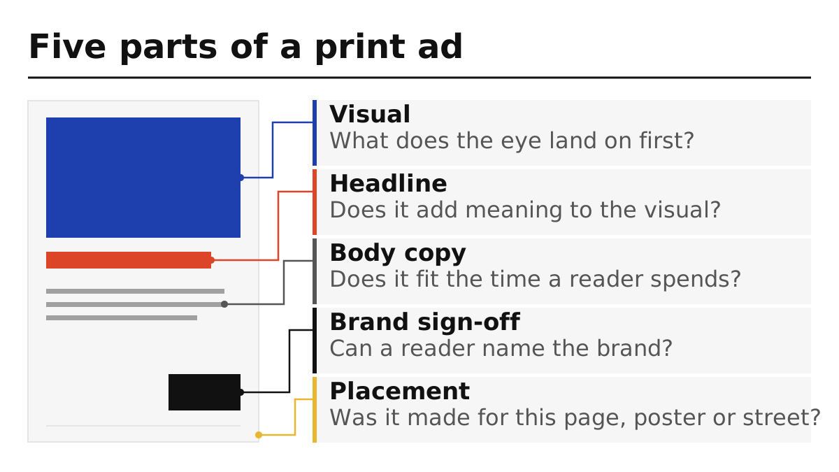
A print ad works when a reader gets one idea in the time they actually spend on it, and the visual, headline, copy, sign-off and placement all serve that idea. Use the five parts below as the common yardstick for every example on this page and for your own drafts.
| Part | Question to ask | What a weak version looks like |
|---|---|---|
| Visual | What is the single image or shape the eye lands on first? | Several competing images of equal size |
| Headline | Does it add meaning to the visual, rather than describe it? | A caption that repeats what the picture shows |
| Body copy | Is there only as much text as the placement allows? | A paragraph on a billboard |
| Brand sign-off | Can a reader name the brand without searching? | A small logo lost in a corner |
| Placement | Was the layout made for this page, poster or street? | A magazine layout squeezed onto a roadside board |
Placement deserves its own line because the same ad reads differently in a newspaper, on a poster and in a shop. If your print piece is a brochure rather than a single page, the brochure software and cost guide covers the tools and file preparation side.
Takeaway: Check every ad, including your own, against the same five parts before judging it “good”.
Examples by use case
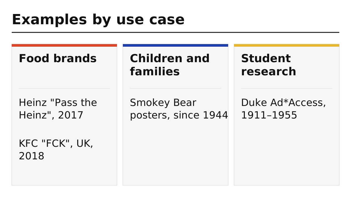
Food brands should start with Heinz, apology or crisis messages with KFC, family-wide public messages with Smokey Bear, and school assignments with the Duke Ad*Access archive. The table gives the format, main technique and source for each.
| Use case | Example | Format and placement | Main technique (our reading) | Source |
|---|---|---|---|---|
| Food brand | Heinz “Pass the Heinz”, 2017 | Billboards in New York City and print | Food without the product; the reader supplies the ketchup | CNBC, March 14, 2017 |
| Food brand, apology | KFC “FCK”, UK, 2018 | Full-page ads in Metro and The Sun | Rearranged logo letters on an empty bucket; plain apology copy | Marketing Week; It’s Nice That |
| Children and families | Smokey Bear wildfire prevention, since 1944 | Posters and print PSAs | A character delivering one instruction | Smokey Bear campaign site; Ad Council |
| Student research (resource) | Duke Ad*Access, 1911–1955 | U.S. and Canadian newspaper and magazine ads | Archive for comparing campaigns over time | Duke University Libraries |
Takeaway: Start with the row closest to your own situation, then read the breakdown for that row.
Food: two ads that leave something out
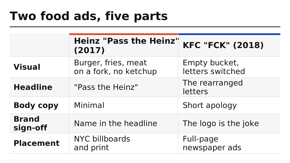
Both food examples remove the expected element, the ketchup in one and the chicken in the other, and rely on the reader to fill the gap. That makes them useful models for restaurants and food brands that need an ad to be understood at a glance.
| Part | Heinz “Pass the Heinz” (2017) | KFC “FCK” (2018) |
|---|---|---|
| Visual | Three images, a burger, fries and a piece of meat on a fork, with no ketchup shown (CNBC) | An empty KFC bucket with the letters switched to “FCK” (Marketing Week) |
| Headline | “Pass the Heinz” | The rearranged letters act as the headline |
| Body copy | Minimal; Heinz said the campaign “doesn’t require paragraphs of copy” | A short apology, including “A chicken restaurant without any chicken. It’s not ideal.” |
| Brand sign-off | The brand name is in the headline | The logo itself carries the joke |
| Placement | New York City billboards and print | Full-page ads in two UK national newspapers |
The Heinz ads have an unusual history: they were first shown to the client in an episode of the TV drama Mad Men, and in 2017 Kraft Heinz credited both the show’s fictional agency and the Miami agency DAVID, according to CNBC. The KFC ad, created by the agency Mother, answered a real problem: restaurants had closed after delivery trouble with a new supplier, and the ad pointed readers to a site with more information, as It’s Nice That and Marketing Week reported.
Common mistake: Copying the “missing product” trick without a product people already picture. Both brands could expect readers to know what was missing; if your audience may not know your product, test whether they can name the missing element before using the idea.
Food packaging carries the same brand cues as food ads; our explainer on seasonal coffee pouch graphics shows how a fixed brand frame can stay recognisable while the artwork changes.
Takeaway: Leave something out only when the reader can fill the gap instantly; otherwise show the product.
Children and families: a character with one instruction
The Smokey Bear campaign shows how a public service message can speak to all ages: one recognisable character, one instruction and a slogan kept for decades. It began with posters in 1944 and is described by the Ad Council as America’s longest-running PSA campaign. The table below is a campaign overview drawn from the official history, not an analysis of a single poster.
| Part | Smokey Bear wildfire prevention (campaign overview) |
|---|---|
| Visual | The bear character; the first Smokey poster was painted by Albert Staehle in 1944, per the campaign site |
| Headline | Slogan “Remember… Only YOU Can Prevent Forest Fires” from 1947; “Only You Can Prevent Wildfires” since 2001 |
| Body copy | Varies by poster; check the individual poster you study |
| Brand sign-off | The character, backed by the Forest Service and partners |
| Placement | Posters and print from the start |
Two details from the campaign’s own history are instructive. Before Smokey, a 1944 poster used characters from Disney’s Bambi with Disney’s permission, which showed the organisers that an animal symbol worked; they then created a character they owned. And in 2001 the slogan changed from “forest fires” to “wildfires” to cover fires outside forests, a reminder that a long-running headline still has to match the message.
Character-led design is sensitive in some regulated categories. If your work involves cannabis packaging or ads in California, our explainer on AB 2249’s rules for cannabis ads and packaging covers the specific rules and dates.
Takeaway: For a broad audience, start with one character and one instruction before adding further messages; to study the design, pick a single dated poster.
Student assignments: where to find and how to analyse ads
Students need examples they can cite, so use a documented archive and the five-part breakdown. Duke University’s Ad*Access collection holds more than 7,000 ads printed in U.S. and Canadian newspapers and magazines between 1911 and 1955, in five subject areas: Radio, Television, Transportation, Beauty and Hygiene, and World War II.
| Step | What to do | Output for your assignment |
|---|---|---|
| 1. Choose a subject | Pick one of Ad*Access’s five areas | A focused set of comparable ads |
| 2. Pick two or three ads | Same product type, different years | A before-and-after comparison |
| 3. Record the source | Archive name, item title, date and publication | A citation your teacher can check |
| 4. Break each down | Use the five parts above | A comparison table |
| 5. Write the finding | What changed in visual, headline or copy over time | Your argument, supported by the table |
Duke notes that the collection is a working file from one agency’s clippings, not a complete record of all ads printed, so say so if your assignment draws conclusions about a whole period.
Takeaway: Cite the archive item, compare like with like, and state the archive’s limits.
A self-check list for your own print ad
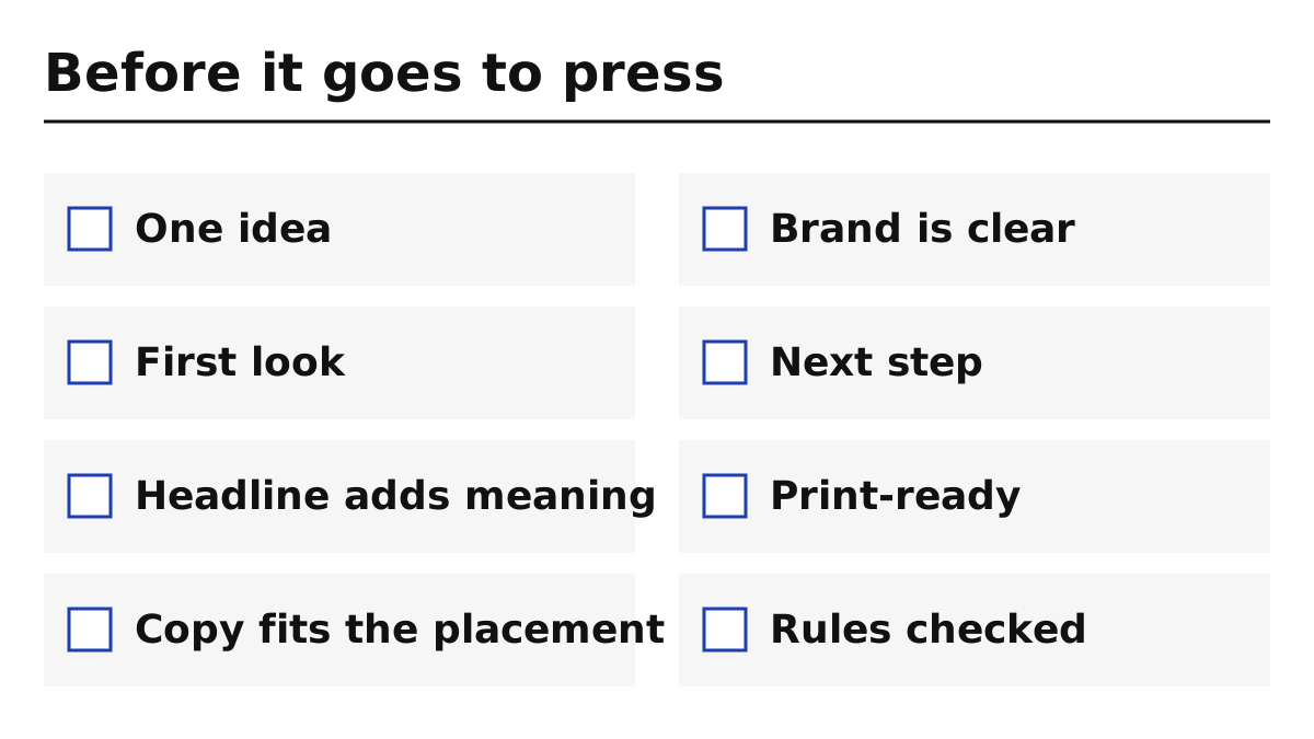
Before sending a print ad to press, check it against the list below; each line maps to one of the five parts or to production. Fix each failed line in its own way: simplify the layout when the page is crowded, add the missing information when the next step is unclear, correct the file to the printer’s specification for production failures, and complete the review when rules are unchecked.
| Check | Pass when |
|---|---|
| One idea | You can state the ad’s point in one short sentence |
| First look | The eye lands on one visual, not several |
| Headline adds meaning | The headline says something the picture does not |
| Copy fits the placement | A reader can finish it in the time they will spend |
| Brand is clear | Someone glancing at the ad can name the brand |
| Next step | The reader knows what to do or remember |
| Print-ready | Colours, bleed and resolution meet the printer’s specification |
| Rules checked | Any category rules, such as food or regulated-product claims, are reviewed |
If your ad sits beside packaging or labels, the product label design guide covers the information a label must carry. Special finishes, such as metallic accents, change how a piece looks on press; see our note on in-line metallic coatings. For food labels that face oil, the questions in our UPM Asendo 80 explainer show how to proof a new stock.
Takeaway: Resolve every failed check before the file goes to press.
When this does not apply
This page explains how to read and learn from print ads; it does not rank ads, measure their results or cover digital advertising. The examples were chosen because their facts can be checked in the cited sources, not because they are the best ever made. Award archives such as Cannes Lions, D&AD and The One Show hold many more examples; they were not used for this page. Sources were read on October 7, 2026.
More guides on layout, colour and paper are in Print Design, brand-system topics in Brand Graphics, and About explains how this independent site works.
Takeaway: Use the examples to learn structure, and your own audience and placement to make decisions.
Related reading
- Brochure design software and cost — Choose a tool and prepare print-ready files for multi-page pieces.
- Product label design guide — Check the information a label must carry.
- Cannabis brand visuals under AB 2249 — Check California’s rules if your work involves cannabis ads or packaging.