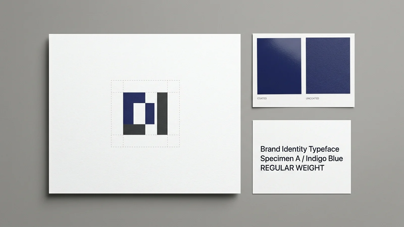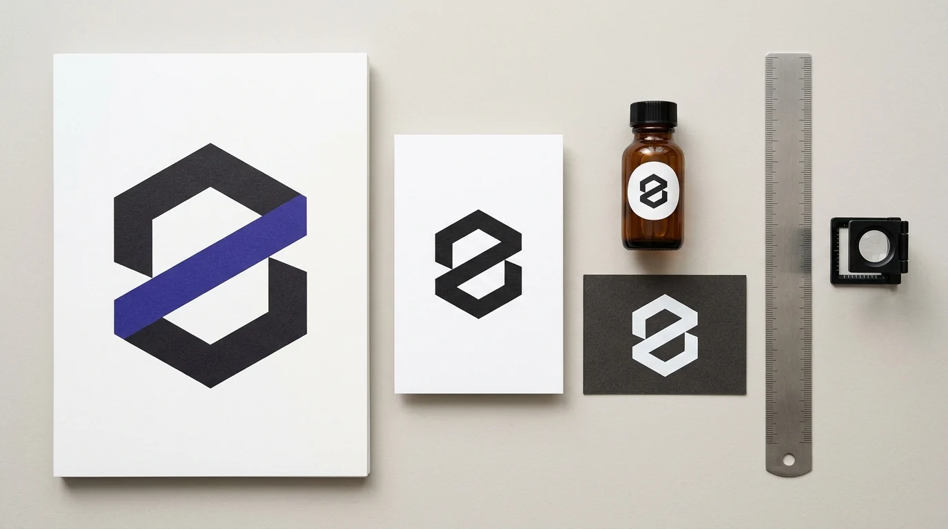
Effective logo design principles prioritize simple silhouettes, decisive figure-ground contrast, proportional clear space, single-ink resilience, and micro-scale simplification so marks stay legible from print proofs down to tiny labels and uncoated cartons. Testing a mark in flat black and reversed white before applying color prevents ink spread from clogging fine details on press.
A screen preview zoomed to full width hides the physical stresses of absorbent paper, extra ink plates, and crowded packaging panels. For companion guides covering print file preparation, ink coverage, and brand documentation, browse our print design and brand graphics articles.
What Are the Characteristics of a Good Logo at Small Print Sizes?
A good print logo relies on bold lines, uncluttered geometry, solid ink areas, and unmistakable silhouette contrast so its shapes stay open when scaled onto small product labels or business cards. Marks built from fragile midtone gradients, extra spot plates, or hairline gaps darken under physical dot gain and lose legibility on absorbent uncoated stocks.
Simplicity, Bold Geometry, and Solid Color
Wikipedia’s logo overview traces durable commercial marks to mid-twentieth-century Modernism, where visual simplicity and conceptual clarity—summed up by Ludwig Mies van der Rohe’s dictum “Less is more”—made logos hold together across expanding print and broadcast media. Because modern brand marks are constantly resized across large surfaces and tight spaces, designers favor bold, simple marks with heavy lines, clear shapes, and solid colors that reduce visual confusion when scaled between media or placed near neighboring graphics.
Color plays an important role in brand differentiation and visual detail detection, yet color should not conflict with logo functionality, and cultural color associations vary across audiences. From a legal standpoint, Wikipedia notes that trademark registration ordinarily protects the visual design of a logo without claiming specific colors, meaning the form itself remains protected across different inks and backgrounds. Designing the silhouette to stand on its own ensures the mark remains recognizable even when color is stripped away.
How Dot Gain and Ink Count Punish Fine Detail
Physical printing introduces ink spread that screen monitors never show. Wikipedia’s dot gain reference defines dot gain, or tonal value increase, as a phenomenon in offset lithography, flexography, and gravure where halftone dots expand beyond the original prepress artwork, making uncompensated prints appear darker than intended. Uncoated papers absorb more ink than coated stocks and therefore exhibit higher dot gain, while press pressure and lower ink viscosity further push ink outward around printed contours.
Gain is greatest in 40% to 60% midtones and becomes more noticeable with finer screen rulings. As Wikipedia illustrates, coated paper printed at 150 lines per inch commonly exhibits roughly 23% dot gain in a 40% tone, and a 19% dot gain turns a 40% prepress tint into a 59% printed tone. Soft gradients and delicate halftone shading inside a miniature logo compress quickly on press, whereas solid flat fills hold crisp boundaries.
Ink count also governs print practicality. Standard offset printing relies on four process inks—cyan, magenta, yellow, and key black (CMYK)—while Wikipedia’s spot color guide notes that every dedicated spot color requires its own film and lithographic plate, increasing production complexity and potential problems as more spot inks are added. On colored backgrounds, institutional guides such as the MIT Logo specification restrict the mark strictly to black or white (outside approved red-on-red treatments) to preserve contrast.
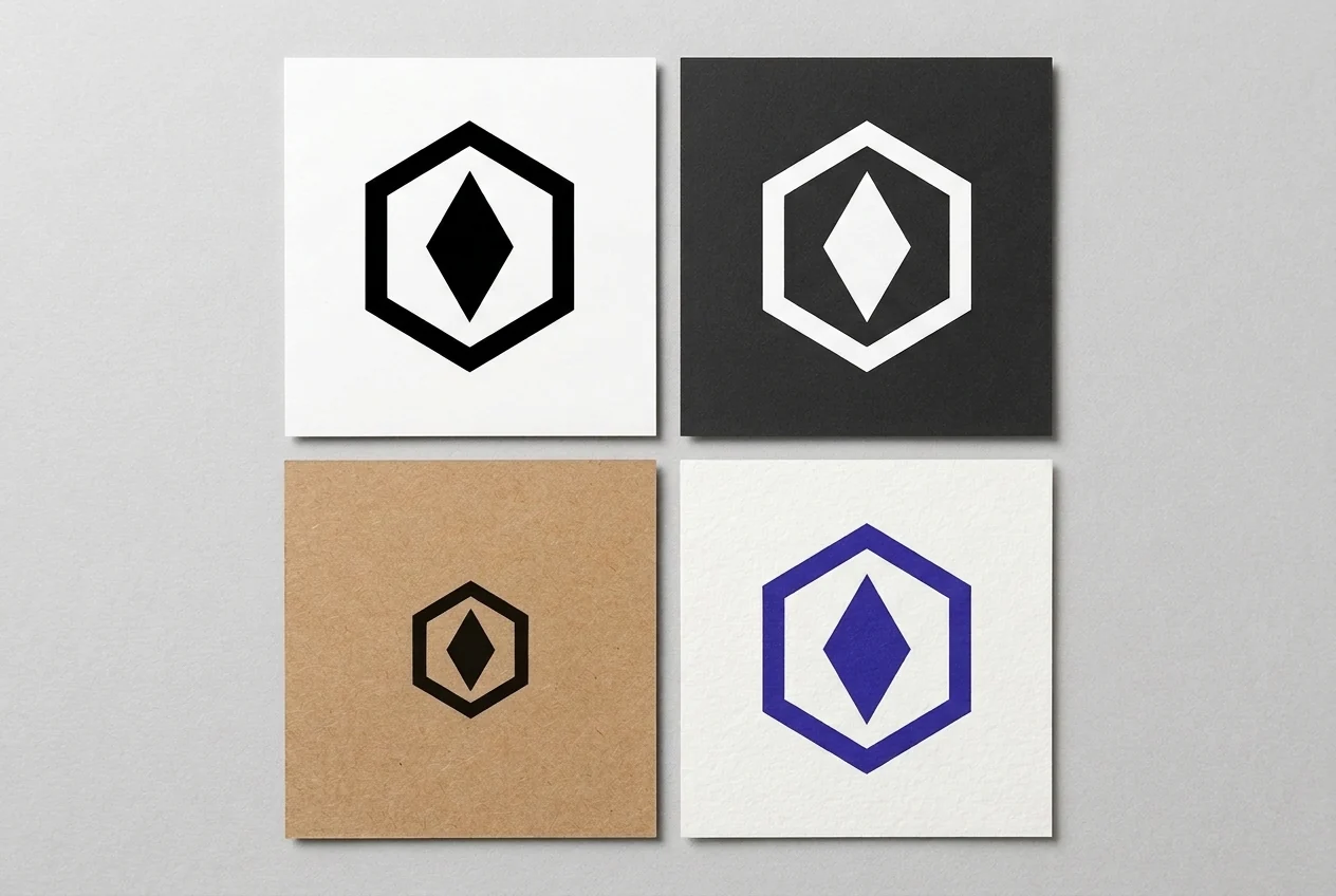
Once the artwork geometry passes single-ink inspection, verify that the delivered master contains genuine vector paths using our vector logo file print checklist. When placing a reversed white version over dark printed panels, check separation behavior with our white logo disappears in PDF overprint guide and review small reversed lettering limits in our knockout type minimum size guide.
How Do Main Types of Logo Design Behave on Print Layouts?
Different logo structures carry distinct trade-offs between instant name readability and extreme downscaling on printed packaging or collateral. Abstract and pictorial symbols survive tight circular labels and cross-language markets well, whereas wordmarks and detailed ceremonial seals demand wider horizontal spans or larger physical footprints to keep every letterform crisp.
Wikipedia defines a logo as a graphic mark, emblem, or symbol used to aid public identification and recognition, grouping designs into three combinable classifications: abstract ideographs such as Chase Bank (a lineage stretching back to the Bass red triangle trademarked in 1876), representational pictographs, and logotypes or wordmarks depicting a name or company initials. Combining a symbol with text in a fixed relative position and scale forms a logo lock-up whose components should not be pulled apart or resized independently.
Each format behaves differently once ink meets paper:
- Abstract ideographs and representational pictographs: Symbols travel cleanly across global markets and multiple alphabets where a written name may lose resonance. However, Wikipedia observes that only a few of the thousands of standalone ideograms in circulation are immediately recognizable without an accompanying name, so younger brands rarely rely on an unlabelled symbol alone.
- Wordmarks and short lettermarks: Full logotypes tie visual identity directly to the company name, while two- or three-character lettermarks fit tighter square spaces. Short initials carry collision risk across industries—Wikipedia points out that CA is shared by Credit Agricole, C&A, and CA Technologies even though only one organization can hold the matching domain name.
- Combination lock-ups: Pairing an ideogram with a logotype emphasizes the brand name while building long-term recall for the symbol, giving print layouts a primary horizontal or stacked banner alongside a detachable mark for tight imprints.
- Detailed emblems and seals: Intricate historical seals pack perimeter text and fine linework inside a closed border. In MIT’s published identity system, the MIT Seal guideline restricts its seal to ceremonial materials in MIT red, black, or white only and enforces a 2.5-inch minimum print size so the perimeter lettering stays legible.
| Logo classification | Visual structure | Print scaling strength | Main print failure mode |
|---|---|---|---|
| Abstract ideograph | Non-representational geometric form such as Chase Bank or the 1876 Bass red triangle | High silhouette retention on tiny labels, stamps, and cross-language packaging | Low recognition without an accompanying brand name for newer brands |
| Representational pictograph | Iconic figurative symbol tied to a recognizable object or visual metaphor | Clear visual cue across multilingual packaging and tight square areas | Fine illustrative interior details fill in under ink spread when scaled down |
| Wordmark or logotype | Custom-set company name rendered as typographic mark | Immediate name recognition on headers, cartons, and print advertisements | Long company names shrink to unreadable lettering on narrow labels |
| Short lettermark | Two- or three-character initials such as CA | Compact horizontal footprint suitable for small seals or narrow headers | High collision risk with other organizations sharing identical initials |
| Combination lock-up | Symbol and logotype locked in fixed relative size and alignment | Flexible brand bridge pairing visual icon with unmistakable name | Stacked multi-line text drops below readable scale on compact imprints |
| Detailed seal or emblem | Intricate historic crest with perimeter lettering (such as MIT’s seal) | Ceremonial authority on diplomas, plaques, and large-format pieces | Perimeter lettering clogs completely below large print minimums (2.5 inches for MIT’s seal) |
How Do Visual Design Principles and Figure-Ground Contrast Shape a Logo?
Strong logos harness human visual perception—specifically figure-ground separation and Gestalt grouping—so the brain locks onto the mark as one unified shape instead of competing fragments. Paired with proportional clear space around the perimeter, these visual principles stop surrounding headlines, borders, and packaging graphics from swallowing the brand mark on crowded print layouts.
Wikipedia’s figure-ground perception entry explains figure-ground organization as the perceptual grouping process that separates a foreground object (“figure”) from its surrounding surface (“ground”), much like black ink words reading cleanly against white paper. Designers can also apply intentional figure-ground reversal—swapping foreground and background colors—to keep marks sharp on dark cartons or embed secondary shapes inside negative space without adding extra ink plates.
Three Gestalt principles documented in Wikipedia’s Gestalt psychology overview directly govern how logo parts cohere at viewing distance:
- Law of proximity: Elements positioned close to one another are perceived as a single group, which advertising and brand logos use to visually bind a symbol and its wordmark into one unit while keeping unrelated page elements separate.
- Law of similarity: Shapes sharing visual characteristics such as form, color, or size group together perceptually, explaining why consistent stroke weights across an icon and its lettering make a combination mark feel engineered rather than pasted together.
- Law of closure: The eye completes broken or incomplete contours into whole forms; Wikipedia cites the IBM logo as a textbook demonstration, where separate horizontal bars are immediately perceived as solid letters and a single unified object.
Protecting figure-ground separation on a busy brochure cover or bottle label requires fixed perimeter breathing room. As a concrete institutional example, MIT’s logo standards require a minimum clear space around the MIT logo, logo lock-ups, and sub-brand logos equal to the width of the letter M in the mark, explicitly so no neighboring text or graphics appear visually connected to it. Expressing clear space as a proportion of an internal logo stroke or letter width scales the protective margin automatically from a wide print ad down to a small stationery card.
When Should You Switch Between Standalone Marks, Lock-Ups, and Micro Variants?
Rather than forcing one intricate drawing onto every print surface, a resilient logo system assigns dedicated lock-ups and optically adjusted micro variants to defined physical height ranges. Switching from multi-line lock-ups to simplified one-line or standalone marks before text collapses preserves legibility across wide headers, square tags, and tiny product imprints.
Published rules from MIT’s brand portal show how one large organization structures scale transitions in print. Treat MIT’s inch measurements as an example built specifically for MIT’s geometry rather than copying those exact thresholds blindly onto a different logo:
- Standard versus micro standalone mark: MIT notes that at very small sizes its logo requires optical adjustments to protect appearance and legibility, specifying its standard MIT logo for print heights above 0.25 inches and a dedicated micro logo for print heights between 0.125 inches and 0.25 inches.
- Standard three-line and one-line lock-ups: MIT’s logo lock-up guide pairs its symbol with the full Institute name in either a three-line or one-line configuration, setting both standard lock-ups above 0.4375 inches tall in print.
- Dropping stacked lines at micro scale: For compact print placements between 0.1875 inches and 0.4375 inches tall, MIT supplies only a one-line micro lock-up and explicitly omits a three-line micro lock-up because the stacked text would become too small to remain legible.
- Choosing standalone marks over full lock-ups: MIT advises weighing audience familiarity, application space limits, and context—using a full lock-up when readers need a clear connection to the full name, and switching to the standalone mark when bold impact or restricted physical space leaves no room for companion text.
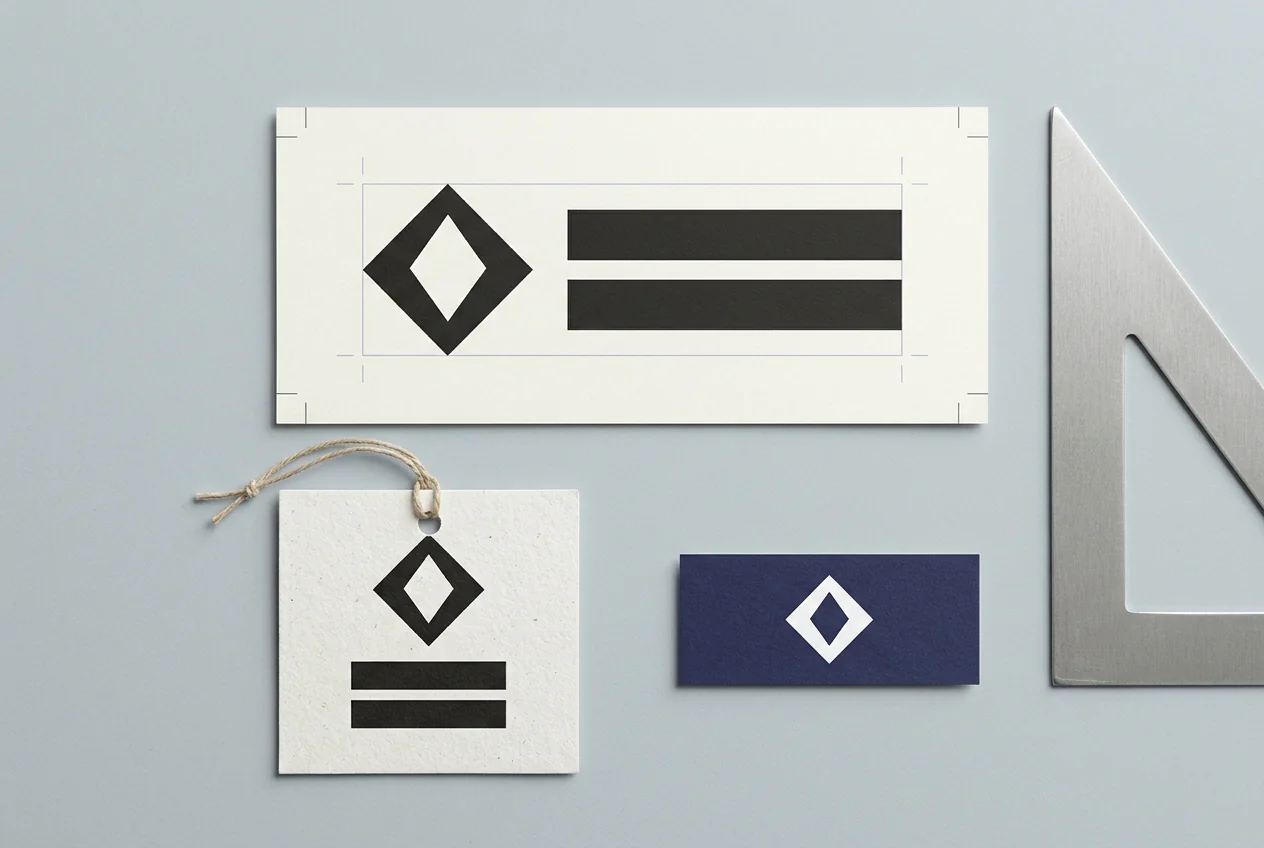
| MIT published mark tier | Configuration scope | Published print height rule (inches) | Print layout rationale |
|---|---|---|---|
| Standard standalone logo | Primary geometric MIT mark alone | Above 0.25 inches tall | High visual impact on covers, signage, and familiar-audience collateral |
| Micro standalone logo | Optically adjusted small-scale MIT mark | 0.125 inches to 0.25 inches tall | Compensates for detail loss at very small physical print scales |
| Three-line and one-line lock-ups | MIT mark locked to full Institute name | Above 0.4375 inches tall | Connects symbol to full institutional name where space allows |
| One-line micro lock-up | Small-scale single-line lock-up only | 0.1875 inches to 0.4375 inches tall | Omits three-line stack so small lettering remains legible |
| Ceremonial seal | Historic intricate seal with perimeter text | Minimum 2.5 inches | Reserved for diplomas and awards so circular lettering prints cleanly |
When mapping lock-up footprints onto compact stationery, align your mark’s clear space with the card trim area in our US and EU business card sizes and bleed guide. To document your own mark’s minimum heights, color builds, and clear-space proportions for print vendors, follow our print brand guidelines specification guide.
How Does the Logo Design Process Fit Into a Brand Identity System?
A logo design concept is not an isolated piece of decoration; it is the visual anchor of a structured brand identity system that must extend cleanly across packaging, labels, typography, and print collateral. Following a disciplined research-to-production workflow—and testing physical print samples before launch—prevents costly redesigns that erode public recognition.
What a Logo Design Concept Must Define Before Sketching
Wikipedia’s graphic design overview situates logos directly alongside colors, packaging, labelling, and typography as core elements of company identity. Before a designer draws a single path, Wikipedia’s logo design process notes that the team must define the brand’s concept, core values, and target audience. From that strategic foundation, the process moves sequentially through research, conceptualization, investigating alternative candidates, refining a selected direction, testing across actual products, and final adoption and production.
In production workflows, graphic designers construct vector logos in dedicated vector tools such as Adobe Illustrator or CorelDraw—keeping artwork resolution-independent—before assembling final brochures, labels, or ads inside page layout software such as Adobe InDesign. Because logos are meant to build lasting customer recognition, Wikipedia stresses that frequent logo redesigns are counterproductive; getting print geometry right during candidate testing saves years of brand fragmentation.
Aligning Marks With Corporate Visual Identity Architecture
Wikipedia’s corporate identity overview explains that a logo (logotype, logogram, or both) operates inside corporate guidelines alongside approved color palettes, typefaces, and page layouts to deliver visibility and recognizability. In MIT’s logos and marks framework, for example, the primary logo anchors the system while the logo lock-up, ceremonial seal, and Tim the Beaver mascot each carry distinct roles rather than competing on the same layout.
How logo rules scale across multiple products also depends on organizational structure. Wikipedia cites Wally Olins’ 1989 corporate visual identity framework, which distinguishes three structural models: monolithic identities that apply one single brand across the whole enterprise, product-line identities that build distinct brands for separate offerings, and endorsed identities where separate sub-brands remain visually linked to a parent mark. Deciding which model governs your catalog determines whether your print templates need one universal lock-up or a shared clear-space rule that pairs a parent logo beside sub-brand packaging marks.
Pre-Approval Print Reproduction Checklist
Before locking final artwork into a brand manual or releasing files for packaging and stationery runs, inspect physical proof prints against each principle below:
| Reproduction check | Physical test condition | Approval criterion |
|---|---|---|
| One-color black silhouette | Print flat black mark at final target label height on uncoated paper | Outer silhouette and interior counters remain distinct without tonal shading |
| Reversed white contrast | Print white mark on dark solid background swatch | Edges stay crisp without surrounding dark ink flooding thin inner strokes |
| Midtone and gradient audit | Inspect 40% to 60% tints on uncoated and coated test sheets | Mark stays fully recognizable if gradients are replaced by solid flat ink |
| Spot-ink plate discipline | Count dedicated spot colors versus standard four-ink CMYK builds | Approved single-ink and CMYK versions exist so low-color runs need no extra plates |
| Proportional clear space | Measure perimeter buffer using one fixed internal mark proportion | Adjacent borders, folds, and body copy cannot visually attach to the logo |
| Lock-up scale handoff | Compare stacked lock-up, one-line lock-up, and standalone mark at small sizes | Stacked lines retire to one-line or standalone variants before lettering collapses |