In Adobe Illustrator, by default when opaque overlapping colors print, the top color knocks out the area underneath, whereas overprinting prevents knockout.
According to CPC Print Promo, in standard process printing white text is the absence of ink (called ‘white’ in Quark and ‘paper’ in InDesign), created by eliminating all ink in the shape of the text.
In Adobe InDesign, the built-in Paper swatch simulates paper color in print previews, cannot be removed, and does not print on composite printers or in color separations.
When preparing print advertisements, brochures, and packaging artwork, use the swatch rules, offset screening parameters, publisher point-size specifications, rich-black keepaway trap settings, and separation checks below before releasing files to production.
Knockout Type Minimum Size, Swatch Behavior, and Overprint Rules
Verify how your layout application defines process black, paper knockout, and overprint attributes before sizing reversed-out text.
- In Adobe InDesign, the built-in Black swatch applies a 100% CMYK process black that overprints underlying inks by default and cannot be edited or removed.
- In Adobe InDesign, the built-in Registration swatch prints objects on every separation from a PostScript printer and cannot be edited or removed.
- In Adobe Illustrator, if Overprint is used on a 100% black stroke or fill, the black ink may not be opaque enough to prevent underlying inks from showing through; a four-color (rich) black with print-shop percentages eliminates show-through.
- In Adobe Illustrator, the Discard White Overprint option in the Document Setup and Print dialogs is switched on by default to remove white overprint attributes when printing or saving to EPS or PDF.
- In Adobe Illustrator, Spot White objects with overprint are not affected by the Discard White Overprint operation, and the source artwork itself remains unaffected.
To troubleshoot white vector marks that vanish completely in separation previews due to accidental overprint settings, follow the companion guide on why a white logo disappears in PDF overprint preview. For a full comparison of black swatch behavior on press, review our guide to rich black versus registration black in print ads.
Dot Gain, Multi-Plate Misregistration, and Offset Lithographic Process Parameters
Review how wet ink spread on absorbent paper fibers and slight cylinder shifts across color units affect fine reversed-out letterforms and hairline strokes.
According to CPC Print Promo, when reversing copy out of a 4-process-color photo, even the tiniest misregistration can cause the text to fill in slightly or show a hint of one of the process colors in the white area, and serifs are so small they can pinch off just from dot gain.
According to The Lane Press, web presses experience minute paper shifts in the thousandths of an inch, causing small white knockout text on a black background to appear out of register with a red or yellow cast.
In Adobe Illustrator, where colors printed from separate plates overlap or adjoin, press misregistration can cause gaps, and print shops use trapping to create a small overlap.
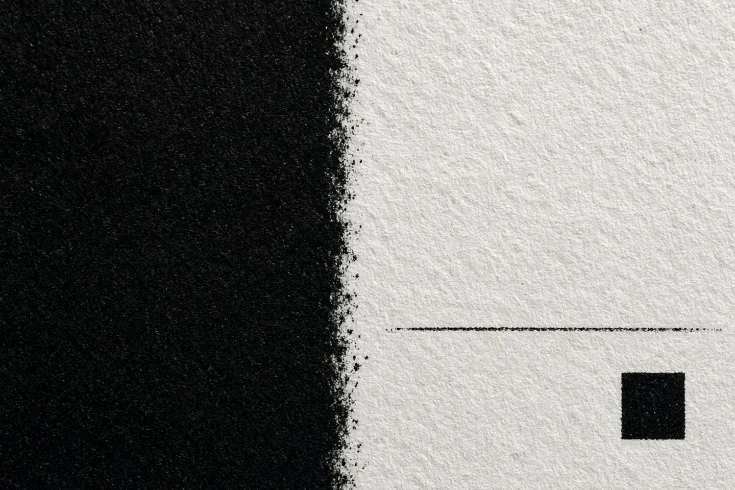
Offset Lithographic Screening, Tone Value Increase, and Ink Sequence
Compare the process control parameters below when evaluating halftone dot reproduction, screen ruling, and ink coverage across coated and uncoated stocks.
| Process aspect | Documented specification |
|---|---|
| Primary parameters | ISO 12647-2:2013 (prepared by Technical Committee ISO/TC 130, Graphic Technology) specifies primary process parameters for offset lithographic print production, defined as the substrate description, the colorant description, the screening description, the tone value increase, and the ink sequence. |
| Tone value | ISO 12647-2:2013 Clause 3.4 defines tone value on a printing forme as the percentage of surface area that is covered by printing ink. |
| Platesetter quality | Clause 4.2.2 of the offset lithographic standard states that platesetter resolution should reproduce at least 150 tone value steps, and for a single halftone cell screen at 80 cm-1 it should not be less than 1 000 cm-1. |
| Metric screen ruling | ISO 12647-2:2013 Clause 4.2.3 specifies preferred nominal periodic screen frequencies of 48 cm-1 to 80 cm-1 for coated paper and 48 cm-1 to 70 cm-1 for uncoated paper. |
| Imperial screen ruling | Note 4 and Example in the offset lithographic standard specify a conversion factor of 2,54 from cm-1 to lpi, yielding preferred nominal screen frequencies of 120 lpi to 200 lpi for coated paper and 120 lpi to 175 lpi for uncoated paper. |
| Non-periodic dot size | Clause 4.2.4 of the offset lithographic standard specifies preferred nominal non-periodic (FM) screen dot sizes of 20 µm to 30 µm for coated paper and 30 µm to 40 µm for uncoated paper. |
| Tone value sum | Clause 4.2.7 of the offset lithographic standard specifies that the tone value sum (total ink limit) for coated substrates should be less than 330% (maximum 350%) for sheet-fed and maximum 300% for heat-set web, while other substrates have a maximum of 300% for sheet-fed and 270% for heat-set web. |
| Ink sequence | Table 1 in the offset lithographic standard requires the ink set to conform to ISO 2846-1 and the standard printing sequence to be Black – Cyan – Magenta – Yellow. |
| Coated conditions | Standard printing conditions PC1 through PC4 map to periodic TVI curve A (60 to 80 cm-1) for PC1 and TVI curve B (48 to 70 cm-1 for PC2; 48 to 60 cm-1 for PC3 and PC4), and non-periodic TVI curve E (20(25) µm, 25 µm, and 30 µm). |
| Uncoated conditions | Standard printing conditions PC5 through PC8 map to periodic TVI curve C (52 to 70 cm-1 for PC5; 48 to 60 cm-1 for PC7 and PC8) and curve B (48 to 60 cm-1 for PC6), and non-periodic TVI curve E (30(35) µm for PC5; 35 µm for PC6, PC7, and PC8). |
To compare ink coverage thresholds across coated sheet-fed, heat-set web, and coldset newsprint runs, see the companion guide on total ink coverage limits for print ads.
Reverse Type Print Advertisement Limits and Publisher Specifications
Match your typography to the receiving printer or publication specification rather than assuming a universal point-size floor across all substrates and presses.
| Publisher or printer | Documented typography and prepress specification |
|---|---|
| Lane Press sizing | The Lane Press recommends that knockout serif fonts be at least 14 pt, relatively bold sans-serif fonts be 10 to 12 pt, and the thinnest stroke in a knockout font be at least .007 inches wide per SWOP standards. |
| Lane Press black | For four-color rich black backgrounds behind knockout type, The Lane Press recommends a CMYK recipe of 50c, 40m, 30y, 100k, where the 100 percent black component cues the press workflow to pull back cyan, magenta, and yellow from the edges of the black background. |
| CPC Print Promo | CPC Print Promo recommends a minimum point size of 10 and a weight of medium, semibold, or heavier for reverse text (illustrating Adobe Garamond Pro at 7 pt vs Myriad Pro Semibold at 10 pt), and advises avoiding thin, light, and condensed faces. |
| Willamette black | Willamette Week's Magazine Ad Specs require all black text to be 100% black (not 4-color or rich black) with a minimum recommended text size of 7 point for 100% black text. |
| Willamette reverse | Willamette Week's Magazine Ad Specs specify 14 pt as the minimum size for color type containing more than 2 process colors, and 10 pt bold as the minimum recommended weight for knockout of color text and for reversed text. |
| Willamette output | Willamette Week Magazine Specs state that total ink density should not exceed 240%, the optimal PDF export setting is PDF/X1A 2001, and images should be submitted at 300 dpi. |
| Daily Herald type | Daily Herald Media Group's magazine ad specifications state that the smallest black type should not be smaller than 6pt black, reverse type or color type is recommended to be a minimum of 12pt sans serif bold (12 pt bold), and white type must not be set to overprint. |
| Daily Herald rules | Daily Herald Media Group magazine ad specifications advise avoiding hairline rules, using a .5 point rule for thin black lines, and using 40% cyan with 100% black for a richer black. |
| Daily Herald black | Daily Herald Media Group magazine ad specifications state that standard black text must be 100%K, not a CMYK mix, not 0R 0G 0B, not 32R 32G 32B, and not automatic or registration. |
| Daily Herald scans | Daily Herald Media Group magazine ad specifications require 300 dpi for color/grayscale photos, line art preferably 1200 dpi and not exceeding 2400 dpi, and PDF-X1a 2001 output. |
| Great West reverse | Great West Media specifies that reverse text out of single-colour screens should not be smaller than 12 point, reverse sans-serif type in multi-colour builds should be a minimum of 14 point, and serif reverse type should not be smaller than 18 point. |
| Great West screens | Great West Media specifies that when using the same colour type in a graduated screen, the screen should not exceed 40% at the location of the type, fine black type and graphics should overprint background elements rather than knocking out, and colour text should be at least 14 point for sans-serif and 18 point for serif. |
| Great West newsprint | Great West Media printing specifications for newsprint and Electrabrite stock specify continuous-tone images should be 200 dpi, line art at least 600 dpi, and colour-photo total density should not exceed 200% on newsprint/Electrabrite. |
| Great West halftone | Great West Media printing specifications for newsprint and Electrabrite stock specify a 2% minimum highlight dot, 95% maximum shadow dot, and 100 lpi line screen. |
| Great West glossy | Great West Media specifies that for sheet-fed printing on coated/glossy stock (300 dpi images, at least 1,000 dpi line art), total ink coverage should not exceed 350%, with a highlight not less than 3% and a shadow maximum of 97%. |
| GH Printing rich | GH Printing art guidelines specify a rich black mix of 30% Cyan, 30% Magenta, 10% Yellow, and 100% Black. |
| GH Printing small | GH Printing art guidelines state that small text or thin lines should use a 1-color black CMYK mix of 0 Cyan, 0 Magenta, 0 Yellow, and 100 Black so only a single plate is needed and the possibility of ghosting is eliminated. |
| MMH magazine | Modern Materials Handling (MMH) Magazine Artwork Specs require PDF/X-1a:2001 export, CMYK mode meeting SWOP standards, and a 300 dpi minimum image resolution. |
While press mechanics govern ink fill-in on small reverse characters, visual hierarchy and viewing-distance legibility across headlines, subheads, and body copy are covered in our guide to print advertising layout hierarchy.
Knockout Text on Rich Black CMYK: Keepaway and Holdback Trapping
Review how prepress trapping engines pull cyan, magenta, and yellow booster screens back from the edges of reversed-out white type so the black key plate defines a sharp letterform boundary.
In Packaging Impressions (‘Making Digital Magic’), Terri McConnell defines prepress trapping as the precise spreading or choking of color areas to accommodate inexact ink registration on press, and defines holdbacks as the trapping technique used when white text reverses out of a four-color photographic image.
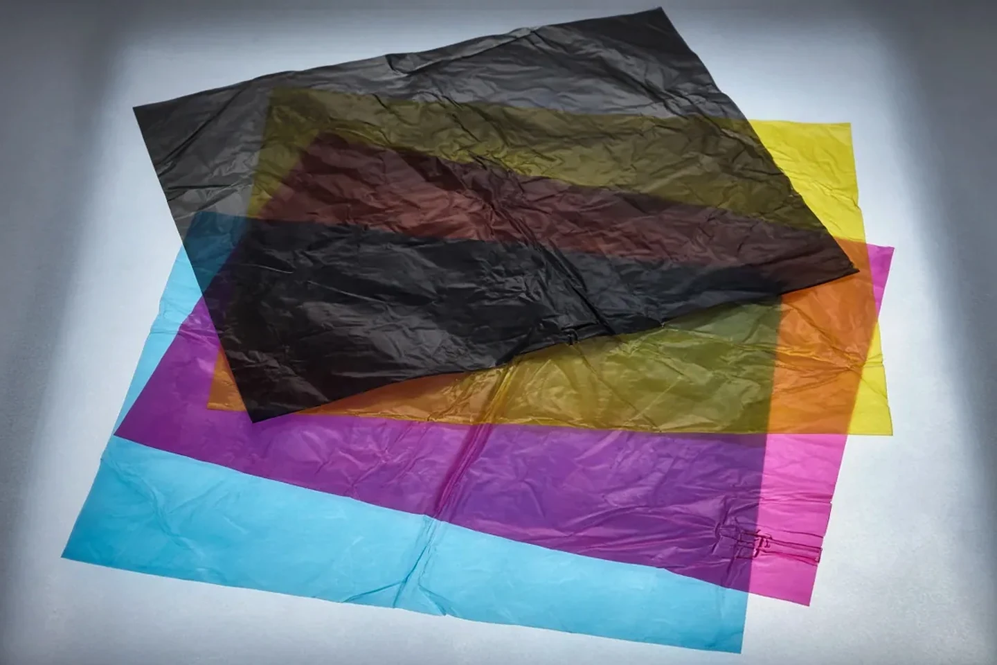
Adobe InDesign Trap Preset Parameters for Rich Black and Knockouts
Check the trap width, holdback, and threshold parameters below when configuring application-level or in-RIP trapping in Adobe InDesign.
| InDesign parameter | Documented behavior and default setting |
|---|---|
| Holdback purpose | In Adobe InDesign Trap Presets, the Black trap width setting determines the distance that inks spread into solid black or the holdback amount—the distance support screens are choked back under black. |
| Width multiplier | In Adobe InDesign, the Black trap width is typically set to 1.5 to 2 times the default trap width; if the default trap width is 0.25 points, the Black trap width might be 0.4 to 0.5 points. |
| Default width | In Adobe InDesign Trap Preset options, the Default trap width has a default value of 0p0.25 and a typical range of 0p0.15 to 0p0.5 depending on press conditions, applied to all color-to-color traps. |
| Black width | In Adobe InDesign Trap Preset options, the Black trap width has a default value of 0p0.5 and cites Neutral Rich Black (40C 30M 30Y 100K) as a popular rich black option. |
| Rich black keepaway | In Adobe InDesign, when support screens (CMY inks) extend to the edge of black areas, misregistration causes visible halos or distorted edges; InDesign uses a keepaway (holdback) controlled by the Black trap width value around reversed-out (knockout) elements in black areas. |
| Activation rules | In Adobe InDesign, to activate black trapping features, a color area must use an ink with a neutral density greater than or equal to the Black Density value and present at percentages greater than or equal to the Black Color value. |
| Thin element limit | In Adobe InDesign, when trapping a thin element such as a black keyline around graphics, the trapping engine automatically overrides the Black trap width setting and limits the trap to half the width of the thin element. |
| Built-in limit | When using Application Built-In trapping in Adobe InDesign, trap widths exceeding 4 points are automatically limited to 4 points during output, while Adobe In-RIP Trapping honors the specified value. |
| Step threshold | In Adobe InDesign Trap Thresholds, the Step threshold specifies the color change threshold at which the trapping engine creates a trap, with a default value of 10% and a recommended range of 8% to 20%. |
| Black color threshold | In Adobe InDesign Trap Thresholds, Black Color indicates the minimum black ink required before the Black trap width is applied, with a default value of 100% and a recommended minimum of 70% for extreme dot gain on low-grade paper stock. |
| Black density | In Adobe InDesign Trap Thresholds, Black Density indicates the neutral density value at or above which InDesign considers an ink to be black, with a default value of 1.6. |
| Sliding trap | In Adobe InDesign Trap Thresholds, Sliding Trap has a default value of 70% and ranges from 0% (all traps default to centerline) to 100% (sliding traps disabled), while Trap Color Reduction defaults to 100%. |
Kodak Prinergy Prepress RIP Trapping and Keepaway Controls
Compare how dedicated prepress workflow tools apply keepaway chokes to rich-black booster screens and fine vector geometry.
- In Kodak Prinergy Tools, a Keepaway Trap chokes lighter inks when a color composed of light and dark inks sits on a white background, avoiding the noticeable color edge caused by registration problems.
- In Kodak Prinergy Tools Rich Black Trap (Prinergy > Trap > Rich Black), a positive Rich Black Width creates a spread and a negative number creates a choke, and the tool automatically generates a 30%C object under the 100% K on a separate Illustrator layer.
- In Kodak Prinergy PDF Trap Editor, selecting the Treat as Black check box on the Inks tab sets a rich black object so that a choke trap is applied to its booster colors to keep colors underneath back from the borders.
- In Kodak Prinergy Tools, an Adobe Illustrator color list cannot have more than 18 spot colors; an RGB-format file cannot be trapped; fonts from Illustrator earlier than CS3 must be updated; and line widths smaller than 0.005 pt cause abnormal trapping effects because those lines deform in Illustrator.
Before submitting logos or reversed badges for RIP trapping, confirm that paths remain clean vector outlines using the vector logo file print checklist.
Prepress Separation Verification in Adobe Acrobat Pro and Halftone Proofing
Inspect the exported production file in separation view and request a halftone proof when verifying fine reverse type and rich-black traps.
- Kingery Printing’s Adobe Acrobat tutorial instructs setting Use Overprint Preview to Always, selecting North America Prepress 2 in Color Management, looking for black coverage larger than 1 square inch or black text larger than 24 pts, then inspecting ink readings in Output Preview.
- In Adobe Acrobat Pro Output Preview, Total Area Coverage specifies the total percentage of all inks used—for example, 280 means 280% ink coverage, which could be accomplished with 60C, 60M, 60Y, and 100K.
- In Adobe Acrobat Pro Output Preview, Sample Size options include Point Sample, 3 By 3 Average, and 5 By 5 Average, which impact individual plate percentages but not Total Area Coverage warnings.
- In Adobe Acrobat Pro Color Warnings, the Rich Black warning diagnoses process black (K) at or above the Start Cutoff percentage mixed with any nonzero C, M, or Y.
- In Adobe Acrobat Pro Output Preview, previewing separations on a monitor does not let you preview trapping, emulsion options, printer marks, or halftone screens and resolution; those are best verified with the print service provider using integral or overlay proofs.
- Packaging Impressions reports that the Kodak Approval XP is a digital halftone proofing device capable of showing color traps, halftone dot structures, and the effect of dot gain.
Minimum Font Size for Reverse Print: Prepress Verification Checklist
Include this verification record with your print handoff package to align typography, rich-black builds, and trapping rules with the print provider.
- Receiving publication or print shop specification: record the required point-size floor, font weight guidance, and stroke-width rule for reversed-out sans-serif and serif type.
- Swatch and overprint verification: confirm that reversed-out paper elements knock out underlying plates and that small dark body copy uses process black rather than a multi-plate build or registration swatch.
- Background build and ink limit: record the printer-specified rich-black recipe and verify that combined ink percentages stay within the substrate limit for coated, uncoated, or newsprint stock.
- Rich-black keepaway trapping: confirm whether the prepress workflow applies a holdback choke to cyan, magenta, and yellow support screens beneath the black key plate around knockout letterforms.
- Separation and halftone proof review: check individual color plates in separation preview and review an integral, overlay, or digital halftone proof before press sign-off.
Browse additional print design and brand graphics guides to coordinate file packaging, bleed setup, and press-ready color separations.
Sources
- Adobe Illustrator User Guide — How to use overprinting in Illustrator
- Adobe Illustrator User Guide — White Overprint
- Adobe InDesign User Guide — Swatch types
- Adobe InDesign User Guide — Set the trap width for colors next to black
- Adobe InDesign User Guide — Trap preset options
- Adobe Acrobat Pro User Guide — Previewing output (Acrobat Pro)
- Kodak Workflow Documentation — Prinergy Trap Tool User Guide
- Kodak Workflow Documentation — Prinergy Rich Black Trap User Guide
- Kodak Workflow Documentation — Prinergy PDF Trap Editor User Guide
- CPC Print Promo — Reverse Text Prepress Guide
- The Lane Press — Knockout Type: How to Make It Pop
- Willamette Week — Magazine Ad Specs & Best Practices
- Daily Herald Media Group — Preparing Ad for Magazine Publication
- Great West Media — Printing Specifications & File Prep Guide
- GH Printing — Art Guidelines
- Kingery Printing — Adobe Acrobat Tutorial: Identifying ‘Rich Black’ problems
- Packaging Impressions (Terri McConnell) — Making Digital Magic
- Packaging Impressions (Jessica Millward) — Spot Meets Dot (Halftone Proofing)
- ISO — ISO 12647-2:2013(E) Graphic technology — Part 2: Offset lithographic processes
- Modern Materials Handling (Peerless Media) — Magazine Ad Specifications