Brand guidelines are a house or corporate style guide that sets standards for the writing, formatting, and design of documents so communication stays consistent within and across materials. In a commercial print handoff, usable brand guidelines also lock the production modules a vendor needs: where the logo appears, how much clear space surrounds it, minimum print height, separate spot-color and process-color files, print point sizes, and the printing condition for the paper substrate.
Public institutional manuals from Massachusetts Institute of Technology (MIT) and Southwestern Oklahoma State University (SWOSU) show how organizations document those modules in practice, though their published measurements govern their own marks and typefaces rather than setting a universal print law. For companion prepress checks covering logo file inspection, layout packaging, and color separation setup, browse our print design and brand graphics guides.
What Are Brand Guidelines in a Print Handoff?
Wikipedia’s style guide overview defines a style guide as a set of standards for writing, formatting, and designing documents to improve communication through consistency. A guide may set practices in writing style, usage, language composition, visual composition, orthography, and typography, covering punctuation, capitalization, citing sources, formatting numbers and dates, and table appearance. Wikipedia groups style guides into comprehensive style for general use, discipline style for specialized fields (often specific to academic disciplines, medicine, journalism, law, government, or business), and house or corporate style created and used by a particular publisher or organization. Some style guides focus on graphic design and typography, while website style guides cover visual and technical rules alongside text.
When an organization orders stationery, brochures, labels, or signage, a corporate brand style guide connects visual identity to press setup. MIT’s logo page states that as the Institute’s primary graphic symbol, the MIT logo should appear across websites, digital collateral, print publications, stationery, and signage. On its downloads page, MIT separates assets by output method into three distinct folders:
- A CMYK folder for process-color print containing .ai and .jpg files.
- A PMS folder for exact spot-color matching in print containing .ai files.
- An RGB folder for digital screen viewing containing .png and .svg files.
Beyond file formats, ISO print-production guidelines explain that a printing condition is specified by parameters in the appropriate part of ISO 12647, including the color and gloss of the paper substrate, the color of the process inks, the screening adopted, and the curves specifying tonal value increase. Naming those parameters keeps a brand guide grounded in measurable press targets instead of screen-only previews.
Which Logo Clear-Space, Lock-Up, and Print-Size Rules Belong in Brand Guidelines?
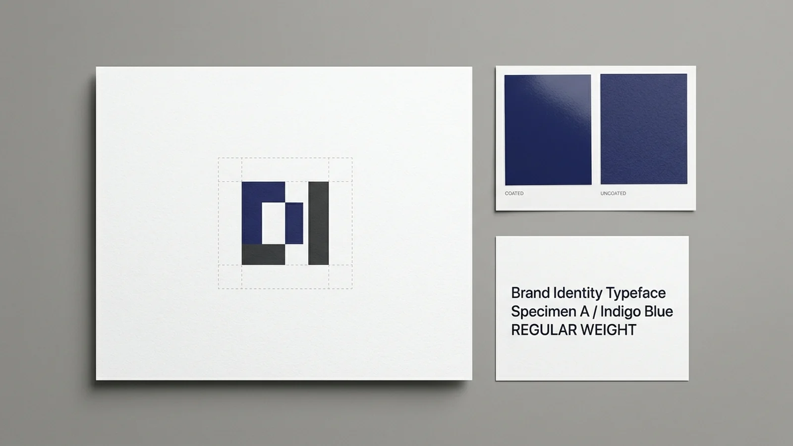
A logo specification module gives layout designers and print vendors three geometric boundaries: proportional clear space around the mark, fixed lock-up geometry when pairing a symbol with the organization name, and minimum print heights for standard and small-scale versions.
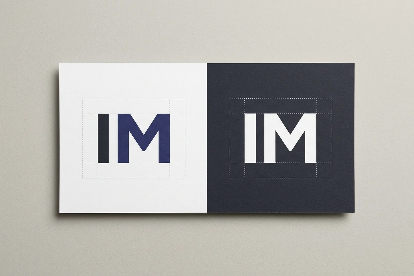
MIT’s brand portal provides a clear example of how one organization records these dimensions for its own artwork. Treat MIT’s published sizes as an example from one organization’s manual rather than copying them onto another mark:
- Clear space: MIT instructs users to always maintain a minimum clear space around the MIT logo equal to the width of the M in that logo, and extends the same clear-space requirement to logo lock-ups and sub-brand logos.
- Lock-up geometry: MIT’s logo lock-up rules explain that placing the MIT logo alongside the full Institute name connects the name and visual identifier, and that lock-ups define the precise positioning, size, and orientation of the full name relative to the MIT logo.
- Print height tiers: MIT specifies its standard logo for print use above 0.25 inches tall and its micro logo from 0.125 inches to 0.25 inches tall. For lock-ups in print, MIT specifies the standard lock-up above 0.4375 inches tall and publishes its micro lock-up print line as above 0.1875 inches to 0.4375 inches tall.
Supply drawn logos and lock-ups as true vector masters. Wikipedia’s entries on vector graphics, raster graphics, and dots per inch explain that vector graphics construct images directly from geometric shapes such as points, lines, curves, and polygons using mathematical formulas, whereas raster images store the color of each pixel in a grid (known in printing and prepress as contones, while line art is usually implemented as vector graphics in digital systems). Because a vector image file is resolution independent, it needs no resampling before resizing and prints equally well at all sizes.
Before distributing brand folders to vendors, inspect AI, EPS, and PDF masters to confirm they hold editable vector paths rather than placed pixel images with our vector logo file print checklist. If your brand manual includes a white reversed mark for dark panels, check separation behavior using our guide on why a white logo disappears in PDF overprint.
How Do Brand Identity Guidelines Separate Production Specs from Brand Voice?
Editorial tone rules help writers sound consistent, yet copywriting guidance cannot tell a press operator which ink build or point size to run. Southwestern Oklahoma State University’s brand standards illustrate clean modular separation by listing Logos and Marks, Colors, Typography, Photography, and Writing as separate brand-standards items.
Within its visual production pages, SWOSU identifies typography as a key component of its brand identity and ties typographic rules directly to named print inks, listing Bulldog Blue (PMS 541 C), Bulldog Gray (Pantone Cool Gray 6), White, and Pantone Process Black among its typography colors. Separating Writing from Logos and Marks, Colors, and Typography lets editors check grammar and capitalization without burying ink specifications, clear-space rules, and point-size floors inside messaging paragraphs.
How Should Brand Guidelines Specify Spot Color, CMYK Profiles, and Paper Conditions?
A print-ready color section separates solid spot inks from four-color process simulations and names the ICC profile or printing condition for coated and uncoated paper stocks.
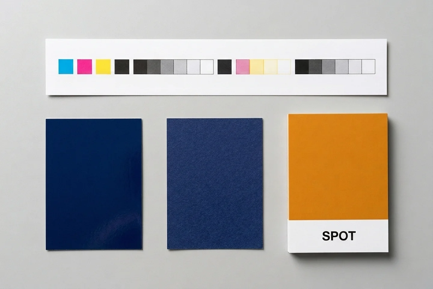
Spot Inks Versus CMYK Process Simulations
Pantone’s Color Bridge Guide Coated displays side-by-side comparisons of 2,359 Pantone Spot Colors (including 224 Pantone Matching System colors) against their closest industry-standard CMYK color matches, alongside HTML and RGB values for digital design, printed on coated stock formulated to match G7-calibrated CRPC6 and CRPC3 press references. In Pantone’s support documentation on finding CMYK values in Pantone Connect, Pantone notes that the CMYK print simulation of Pantone 100 C is Pantone 100 CP in Color Bridge Coated.
Because a premixed spot ink and its four-color halftone simulation are different ink builds, list both in your brand color table so vendors know when to run a dedicated PMS plate and which CMYK breakdown to use on four-color jobs. Assign profile conversion responsibility between designer and prepress using our CMYK versus RGB print handoff guide, and point layout teams to printer-verified dark backgrounds in our rich black versus registration black guide.
Characterization Data, FOGRA51, FOGRA52, and GRACoL Conditions
ISO print-production guidelines state that characterization data comprise a set of tone values and associated colorimetric values that describe a printing process, note that a characterization may be referred to by a commonly used name maintained by an association or organization (such as FOGRA51), and explain that tone value increase (TVI) curves, previously called dot gain, can be adjusted on digital data or during printing-form production. Fogra similarly states that characterisation data combine device-dependent control values (such as K, RGB, CMYK, or CMYKOGV) with resulting colour values such as CIELAB.
In European sheet-fed and web offset workflows, Fogra and the European Color Initiative (ECI) document the current coated and uncoated references alongside an older fallback profile:
- FOGRA51 (PSO Coated v3): Fogra lists FOGRA51 as sheet-fed offset at 60/cm on PS 1 (former PT 1/2) with profile name PSO Coated v3, and ECI describes it for premium coated paper under ISO 12647-2:2013 PC 1.
- FOGRA52 (PSO Uncoated v3): Fogra lists FOGRA52 as sheet-fed offset at 60/cm on PS 5 (uncoated stock with optical brightening agents, OBA) with profile name PSO Uncoated v3, and ECI describes it for wood-free uncoated white paper under ISO 12647-2:2013 PC 5. Fogra’s table footnote notes that the asterisked TVI curves on these rows differ from ISO 12647-2:2007, and ECI notes that the revision of ISO 12647-2 changed process aim values for ink solids and tone value increase curves.
- Older coated fallback versus matched profile: ECI states that ISO Coated v2 300% (ECI), an older coated profile distinct from PSOcoated_v3.icc, is a good choice when the intended printing condition is not yet known because a 300% maximum total ink coverage gives higher flexibility across sheetfed and web offset printing. ECI, bvdm, and Fogra recommend selecting the ICC profile that matches the intended printing condition for both color conversion and proofing.
Two North American industry bodies publish slightly different expansions of the GRACoL acronym. Idealliance states that SWOP stands for Specification for Web Offset Publications and GRACoL stands for General Requirements and Applications for Commercial Offset Lithography. PRINTING United Alliance describes GRACoL as General Requirements for Applications in Commercial Offset Lithography, developed by PRINTING United Alliance and its Idealliance Print Properties Committee.
Idealliance explains that moving from densitometer density and dot-gain measurements to spectrophotometry using LAB and Delta E tolerances to achieve gray balance is the basis of G7. According to Idealliance, GRACoL 2006 was based on G7 methodology and ISO 12647-2 because sheet-fed printing normally ran on a higher quality grade of paper that produced a wider color gamut; GRACoL 2013 was introduced to accommodate papers with optical brightening agents (OBAs) that create a bluer white point and whiter visual appearance; and ISO/PAS 15339, also known as CGATS21, was approved for use in 2015. PRINTING United Alliance describes the matching reference rows in practical terms: ISO15339-CRPC3 covers utility printing on a matte uncoated type paper, ISO15339-CRPC5 covers typical publication printing, and ISO15339-CRPC6 covers large-gamut (typically commercial) printing on the premium coated condition labeled PremCoated.
| ICC profile filename | Reference and printing substrate condition | Total area coverage (TAC) | Max black | Tone value increase (TVI) |
|---|---|---|---|---|
| PSOcoated_v3.icc | FOGRA51; ISO 12647-2:2013 Printing Substrate 1 Premium Coated sheet-fed and heat-set web offset | 300% | 96% (black start 10%) | CMYK 16% |
| PSOuncoated_v3_FOGRA52.icc | FOGRA52; ISO 12647-2:2013 Printing Substrate 5 wood-free uncoated sheet-fed and heat-set web offset | 300% | 96% (black start 10%) | CMYK 22% |
| GRACoL2013_CRPC6.icc | CGATS21-2-CRPC6; ISO DIS 15339-2 | 320% | 100% | CMY 16%, K 19.1% |
| SWOP2013C3_CRPC5.icc | CGATS21-2-CRPC5; ISO DIS 15339-2:2013 | 300% | 100% | CMY 16%, K 19.1% |
| GRACoL2013UNC_CRPC3.icc | CGATS21-2-CRPC3; ISO DIS 15339-2:2013 | 280% | 100% | C 19%, M 19.1%, Y 19%, K 22.1% |
Data compiled from International Color Consortium (ICC) Profile Registry records for ECI and Idealliance profiles. Notice how total area coverage and TVI values shift across coated, publication, and uncoated records; to inspect ink sums in exported PDFs before delivery, see our total ink coverage limit guide for print ads.
Which Typography, Resolution, and Bleed Rules Belong in Basic Brand Guidelines?
Before a small business orders business cards, brochures, or labels, its brand style guide should record print type sizes in points, placed raster image resolution in pixels per inch, and document bleed and trim rules.
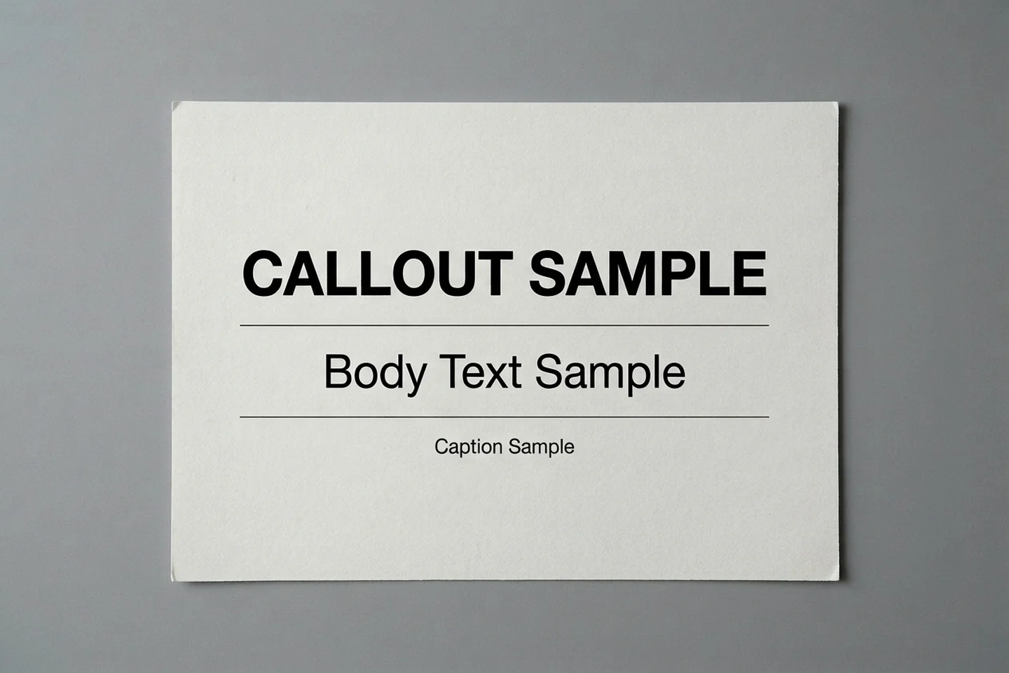
Print Type Hierarchy in Points
Wikipedia’s dots per inch reference notes that 1 typographic point under the modern definition is tied to the 72-point international inch (25.4 mm). SWOSU’s typography standards show how one institution separates print point sizes from screen pixel sizes for its own fonts (treat these as an example from SWOSU’s guide rather than a universal minimum):
- Body copy: 10 to 12 pt for print and 14 to 16 px for digital/web, with print body text set no smaller than 10 to 12 pt depending on the typeface.
- Captions: 8 to 9 pt for print and 12 to 14 px for digital.
- Callout type: minimum 12 pt for print and 14 px for digital.
- Accessibility checklist floor: minimum 16 px for digital type and 10 pt for print type.
For reversed-out text on dark backgrounds, see our knockout type minimum size guide.
Placed Raster Image Resolution: PPI Versus DPI
Wikipedia distinguishes DPI (dots per inch), the output resolution of a printer or imagesetter, from PPI (pixels per inch), the input resolution of a photograph or image. Adobe Photoshop documentation defines resolution as how densely pixels are packed when printed or displayed, measured in pixels per inch (ppi) or pixels per centimeter without altering the underlying pixel count, and notes that 300 pixels per inch (ppi) is considered the industry standard for high-quality prints because professional printing typically needs 300 ppi. In Adobe’s sizing example, a 1000 by 1000 pixel image prints at approximately 13.9 by 13.9 inches at 72 ppi, compared with 3.3 by 3.3 inches at 300 ppi.
Bleed, Trim, Slug, and Margin Zones
Wikipedia’s printing bleed article defines bleed as printing that goes beyond the edge where the sheet will be trimmed, stating that imperial bleeds are generally 1/8 of an inch from the cut and metric bleeds are generally 2 mm to 5 mm from the cut (varying by printing company), while a standard bleed is very similar to 3 mm and large-format posters usually allow an extra 0.25 inches (6.35 mm) on all sides. Adobe InDesign documentation states that the bleed area accommodates objects extending past the page edge to prevent white gaps after trimming, and notes that the industry-standard bleed is typically 0.125 inches (3 mm), which should be verified with the print provider.
Outside the trim box, Adobe InDesign documentation explains that the slug area holds printing instructions, page information, and color bars that are discarded when the document is trimmed to final size. Inside the trim box, Wikipedia’s bleed diagram labels trim as where the product will be cut, bleed as the zone outside the trim area, and margin as the zone inside the trim area without assigning a universal safe-zone distance. For publication-specific bleed, trim, and live-area insets, see our print advertisement bleed, trim, and live-area guide.
Should Brand Guidelines Be Delivered as a Press-Ready PDF?
Brand guidelines do not have to be formatted as a press-ready PDF. Public brand portals such as MIT’s publish their rules as web pages linked directly to downloadable CMYK, PMS, and RGB logo folders, and a lightweight internal page or reference sheet works just as well when it records the vendor-facing print modules clearly.
| Brand guide module | Print specification to record for vendors |
|---|---|
| Logo variants and lock-ups | Standard logo, micro logo, logo lock-up, and sub-brand logo geometry alongside separate CMYK (.ai, .jpg), PMS spot (.ai), and RGB digital (.png, .svg) asset folders |
| Clear space and minimum print height | Proportional clear-space unit (such as one letter width in the mark) and published print height ranges for standard marks and lock-ups |
| Spot and process color builds | Exact spot-ink designations beside approved four-color CMYK simulations for coated and uncoated runs |
| Paper printing condition and ICC profile | Matched coated and uncoated characterization targets (such as FOGRA51 PSOcoated_v3.icc and FOGRA52 PSOuncoated_v3_FOGRA52.icc, or GRACoL 2013 CRPC6 and CRPC3) |
| Print typography hierarchy | Typeface weights and point-size ranges for callouts, body copy, and captions, kept distinct from brand-voice writing rules |
| Resolution, bleed, and trim notes | Vector master requirement for line-art marks, 300 ppi target for placed contone photos, and printer-verified bleed, slug, and inside margin settings |
Keep the brand style guide distinct from the production layout package for an individual print job. When releasing a finished brochure, stationery layout, or carton mechanical to a vendor, bundle native files, linked graphics, and font records using our InDesign package, links, and fonts print handoff guide.